Since more and more people prefer searching via smartphones and tablets, the importance of mobile-friendliness of websites is gradually growing. This requirement is also boosted by the fact that Google realized the users’ need to search conveniently through mobile gadgets. That’s why, in order to meet this need and make search more convenient for them, the algorithms of the biggest search engine push mobile-friendly websites higher in rankings, even if their desktop versions do not show competitive performance.
This new strategy to search ranking is called mobile-first indexing. Businesses have to pay a lot of attention to this aspect if they want to increase their conversion and online sales.
If your website is built on WordPress, this tutorial is exactly what will help you to optimize it for mobile-first indexing. Read it till the end and you will learn a lot of valuable tips, but first, let’s specify the importance of mobile-first indexing for online resources.
Introduction: Why is This So Important?
Foremost, we have to specify that mobile-first indexing isn’t just a conspiracy theory of SEO enthusiasts, but an official strategy revealed and accepted by Google in November 2016 as a response to a growing number of users who use the search engine services through smartphones and tablets.
Thus, if you aim to achieve the best results with your WordPress website, you should never ignore or neglect this aspect. Adhering to this approach will provide your website with a number of considerable advantages:
- Meeting User Needs: If Google has the data that claim most users look for online content through mobile devices, potential entrances to your website won’t be an exception. Optimization of a WordPress-built platform will help the platform to meet its users’ needs and make their overall experience much more positive.
- Improved Search Rankings: A big portion of your website’s success depends on how high it will be ranked in the Google search. Users won’t simply visit it if they come across a competitive platform ranked higher. Since Google officially announced mobile-friendly indexing, following this requirement is your opportunity to make your resource more visible to the majority of users.
- Increased Traffic and Conversions: The higher your website is ranked in the Google search, the more likely it is to get higher traffic than competitors. Besides, if you make the WordPress platform user-friendly for mobile enthusiasts, you are more likely to retain their attention. This way you will also ensure the increase in online sales and conversion.
- Competitive Advantage: The truth is that not all website owners know about the existence of this specific approach by Google. That’s why they keep focusing on the desktop performance of their sites, completely neglecting mobile-friendliness. Some of your competitors are very likely to act the same way, that’s why mobile-first indexing is your chance to outperform them.
Here are the most efficient tips that will help you to achieve your optimization goals.
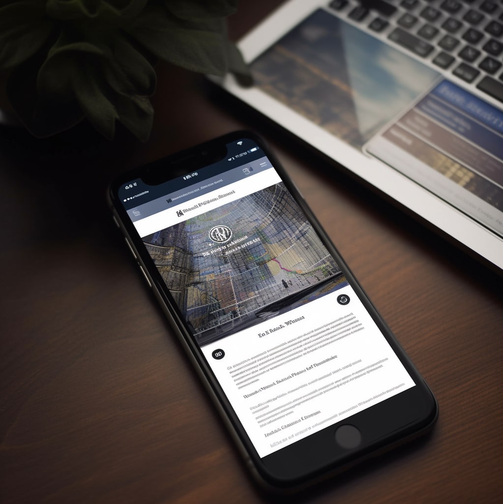
Use a Responsive Design

This is one of the most important features to keep customers interested in the represented services and goods. What’s more, visitors are more likely to spend more time on a website with a responsive design than on a platform with poor UI/UX but with high-quality services. That’s true: Internet users pay a lot of attention to the convenience of online surfing.
Considering this, WordPress websites have a considerable advantage over their competitors. The fact is that WordPress themes always have a responsive design for both mobile-friendly and desktop websites. The only thing you should be concerned about is whether your WordPress theme is updated because some earlier versions of themes might not be as responsive as necessary for high ranking. All you need to do is follow the performance of a theme and change it to an updated version when it’s necessary.
Optimize Page Speed
A responsive design is crucial but, as a matter of fact, it is the second feature of your website the users will encounter. The first aspect that will affect their first impression is the loading speed. If your website isn’t optimized to load quickly on mobile devices, traffic and ranking in a search engine might suffer quite a lot.
What’s interesting to explore is that desktop loading speed doesn’t even matter anymore. Didn’t expect that? Yes, since the adaption of this new policy, Google has paid attention only to mobile loading speed while ranking websites.
Of course, taking the best of both worlds would be perfect, but if your time and resources are limited, we suggest that mobile loading speed should be prioritized, and here are the tips to do this properly:
- Implement Lazy Loading: This is a special function that enables the loading of media only when they should become visible to users. Lazy loading can be implemented with such tools as WebP.
- Minify CSS, HTML, and JavaScript: Minifying CSS, HTML, and JavaScript files helps to reduce file size, eliminate redundant code, consolidate code, and improve browser parsing, all of which contribute to faster page loading speed and better user experience on a website.
- Enable Browser Caching: Browser caching is a technique that allows web browsers to store and reuse certain files, such as images, stylesheets, and JavaScript files, locally on a user’s device. This helps to speed up page loading times as the browser doesn’t have to re-download these files from the server every time the user visits a page

Use Mobile-Friendly Fonts
Don’t judge the book by its cover. We bet you’ve heard that proverb multiple times. However, the truth is that it completely loses its relevance for online content. People judge online resources not only by their designs but even by their fonts!
The font is a crucial feature of the visual and textual content on the website. Making sure that it’s mobile-friendly greatly affects the engagement of visitors. If they find it inconvenient to learn something on your WordPress website because of its font, they will simply exit and look for something more clear and understandable on the resources of your competitors.
Considering this, we suggest using these mobile-friendly fonts:
- Adobe Garamond
- Baskerville
- Computer Modern
- Georgia
- Trebuchet
- Open Sans
- Roboto
- Montserrat
You may ask, how we did choose these exact fonts. In a nutshell, we just took into account several crucial criteria:
- Legibility: Avoid fonts that are too thin, overly decorative, or have complex letterforms that may be difficult to read on smaller screens.
- Responsiveness: Ensure that the font is responsive and adjusts well to different screen sizes and orientations. It should not break, overlap, or become illegible when viewed on different mobile devices.
- Typeface and Style: Avoid using too many different typefaces or styles, as it can create visual clutter and compromise readability.
- Contrast: Avoid using light-colored fonts on light backgrounds or dark-colored fonts on dark backgrounds, as it can strain the eyes and make the text difficult to read.
- Accessibility: Consider accessibility guidelines, such as WCAG (Web Content Accessibility Guidelines), when choosing a font for your website. Ensure that the font is accessible to users with visual impairments or other disabilities and that it can be easily resized or read by screen readers.
Optimize Images and Videos
- Efficiently Compress and Resize Images: Utilize image compression tools or WordPress plugins to effectively reduce the file size of images while maintaining their quality. Additionally, resize images to fit the appropriate dimensions for mobile screens, preventing unnecessary bandwidth usage and enhancing loading times.
- Opt for Optimal File Formats: Choose the right image file formats, such as JPEG for photographs and PNG for graphics with transparency. Avoid using bulky formats like BMP or TIFF which may lead to longer loading times on mobile devices.
- Implement Lazy Loading: Employ lazy loading for images and videos, loading them only when they become visible on the user’s screen. This can significantly reduce initial page load times and improve the overall performance on mobile devices.
- Optimize Video File Sizes: Compress video files to minimize their size without sacrificing quality. Consider using video codecs optimized for streaming on mobile devices, such as H.264 or H.265.
- Utilize Responsive Video Embeds: Embed videos using responsive techniques that automatically adapt the video size and aspect ratio based on the screen size and orientation. This ensures that videos are displayed correctly on various mobile devices, avoiding distortion or cropping.
If you don’t want to look for multiple tools to do all this stuff, you can rely on WebP. This is a special solution developed by Google to optimize media for websites, including mobile-friendly ones. It compresses images and videos and supports lazy lading, which also increases page speed.
Leverage AMP technology
AMP stands for Accelerated Mobile Pages. This is a special solution designed for the purpose of developing fast-loading mobile-friendly pages on websites. This technology, developed in 2015, was a predecessor for mobile-first indexing, accepted a year later. Considering this, we can draw a conclusion that this technology really helped website developers to make their solutions more engaging and user-friendly for mobile enthusiasts.
The Accelerated Mobile Pages technology is based on an open-source code. The solution utilizes streamlined HTML, CSS, and JavaScript to deliver a seamless and speedy user experience on mobile devices, resulting in improved website performance, reduced bounce rates, and increased engagement. If you leverage this technology for your WordPress website, you will greatly increase the chance to boost its speed and thus improve its ranking in Google search.
Test Your Site’s Mobile-Friendliness

Once all the steps above are made, what else should you do? As in any development process, testing is the final stage. Mobile-friendliness of your website can also be tested not just by users who will assess it but by algorithms that will estimate the design responsiveness, page speed, fonts, images, and other features and will provide clear recommendations on what should be improved and how it should be done.
Google’s Mobile-Friendliness Test is the most popular tool as it provides insights into how well a website performs on mobile devices and offers recommendations for improving mobile-friendliness. The other popular alternatives are PageSpeed Insights by Google, Bing Mobile Friendliness Test, GTmetrix, Mobile-Friendly Test by Varvy, Sitechecker, and others.
We hope that this how-to guide will help your WordPress website achieve new heights and generate more revenue for your business! For more interesting insights on WordPress development, contact our team and follow the updates in this blog!